
Sweet Night is an app which looks for shops, cafeterias and restaurants near user’s location, that are open at night hours (at the time of user’s browsing) and offer sweets.
Also the app enables users to make purchases directly within it, and ask for delivery or go to pickup the goods by themselves.
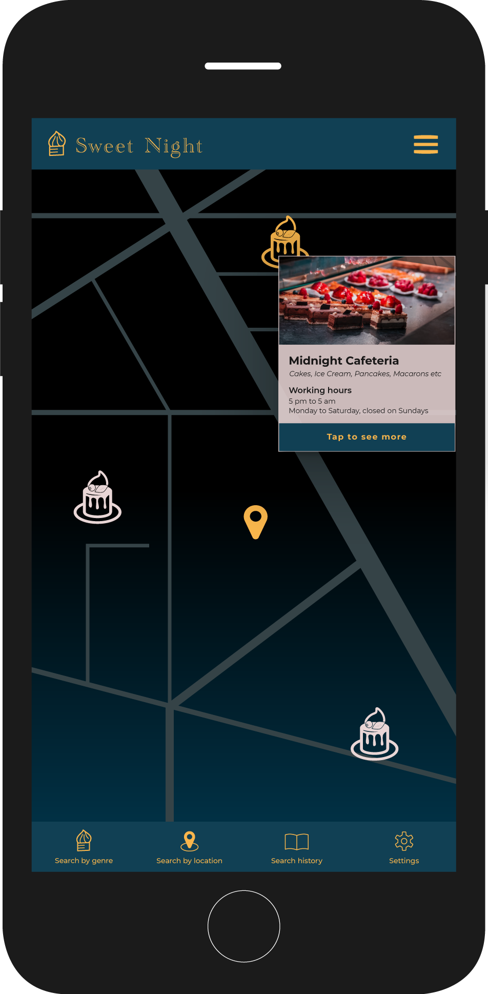
Main Screen
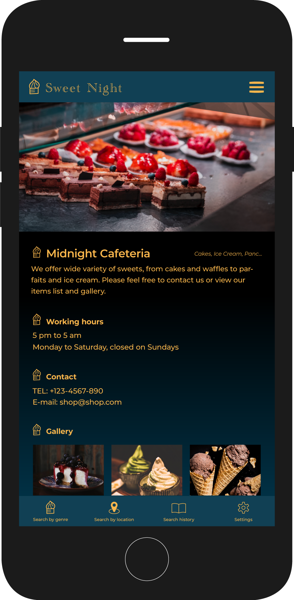
Sub Screen
Main Task
This project is a submission task for my Coursera UI/UX training.
The task was to create UI for an app of any service we can imagine, maybe even not possible at the current time.
I’ve came up with an idea of a midnight sweets app. I imagined a world where you can eat any amount of carbs and sugar without having any bad effect on your health. (Yes, a dream world :))
Since my app was meant to be used only at night, I went with dark appearance to create silent, seductive world of only you and sweets you like.
Moodboard
I’ve gathered a lot of dark images with sweets which I thought to be perfect for my project. My app covers any type of sweets, so I picked up various photos from ice cream and macarons to pancakes.
Aren’t they just gorgeous?


Colors
- Black
- White
- Blue
- Yellow
- Blue and Black Gradient
Since my app has a silent night-like atmosphere, I have chosen blue color and blue-black gradient as main colors and bright yellow with pinkish silver as accent colors.
Main Icons


I made few sweets icons for category types, and some main functionality icons, such as location mark, home mark, hamburger menu and movement controls.
I tried to keep consistency by using certain stroke weights and corners’ roundness.
Typography
I chose Academy Engraved LET as a logotype font, because I thought the letter ‘g’ gives an impression of something like whipped cream. Also this serif font is very delicate and transparent, and letters ‘c’, ‘e’ and other resemble a moon symbol, which is also good for communicating app’s main idea.
Secondary typeface was Montserrat, a beautifully legible sans-serif font for using within the app.

Main font: logotype


Sub font: app text
